False positives in UI design: when small buttons are better than big ones
The iPhone X is a near perfectly designed device. I’ve owned mine a year and a half now, and I’d be hard pressed to articulate more than a couple complaints. But there is one problem (filed under the very first of First World problems) that gets to me again and again: its buttons are too big. Way too big.
See if this sounds familiar: you’re holding the phone in landscape intending to take a photo, your forefinger resting on the volume up button to use it as a shutter. As you press it, you accidentally put pressure on your thumb resting on the phone’s power button, which is so big that there’s no way for your thumb not to be resting on it. The screen turns off. You turn it back on and start over.
At first glance big buttons might strike you as a feature, and when you first start using a device, they are. Bigger is discoverable: buttons are easier to find, both by visual inspection, and by feel. Bigger is accessible: buttons are easier to press for people with less tactile precision. Bigger buttons put features within easy reach.
But as users progress along the learning curve and get more familiar with their device, what was initially good becomes bad. Unintentional actions start to manifest: activating the screen, changing the volume, taking screenshots – they’re small problems, and only occur at a background ambient level, but they don’t go away. The bigger buttons make intentional actions easier, but accidental ones easier too.
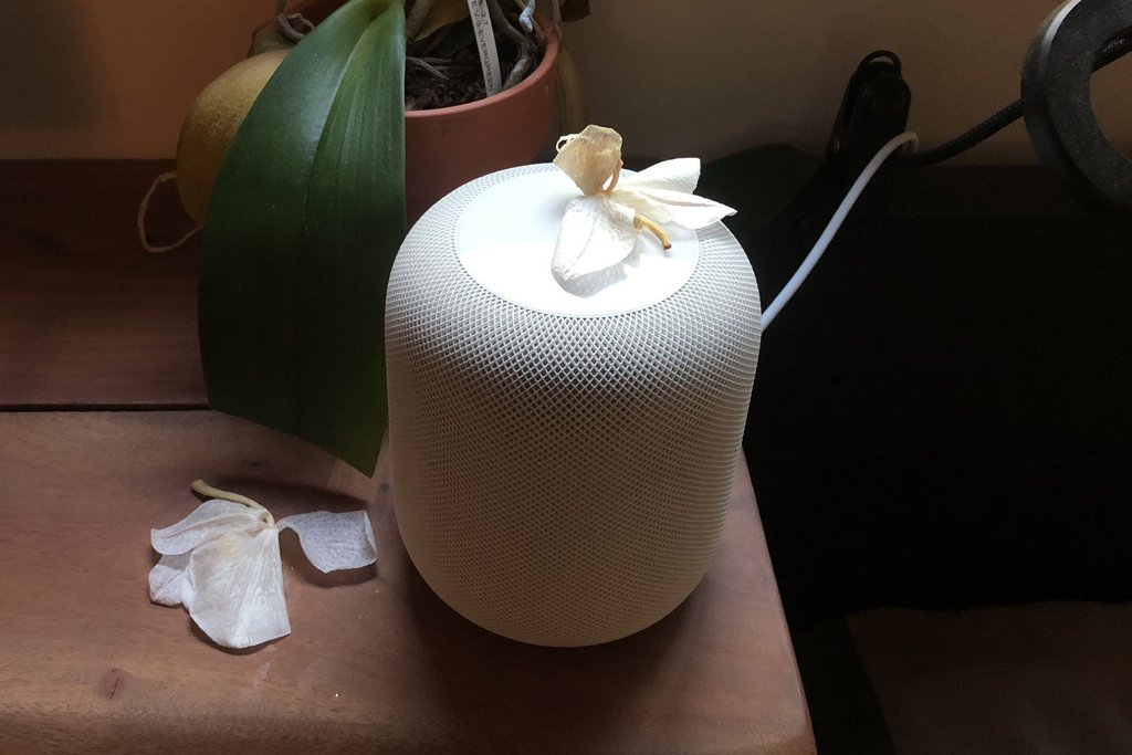
And it’s not just an iPhone problem – the HomePod (as another example) is the true apex of false positive design. Touching its top surface will prompt it to play random music – a feature I’ve activated dozens of times, and not once on purpose. One day I came home to find mine blaring away, apparently of its own volition. I was just getting my exorcism gear out of storage when I noticed something on top of it. A dead flower – weighing only a few grams – had fallen off a nearby orchid, landed on top of the HomePod, and activated it (see photo above).
Producing a better lifetime experience
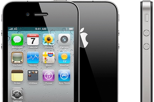
Apple didn’t always get this wrong, the iPhone 4 (and later SE) were a golden era as far as buttons were concerned. Volume buttons were small, circular, and stiff – absolutely perfect for a feature that’s never going to be used more than a few times per hour. The on/off button is a little bigger, but also small and stiff. Despite the reduced size, after just a few days getting used to the device, all of them are easy to find by feel.
Bigger buttons may be initially more user friendly, but over the lifetime of ownership, think about where on the sophistication curve users are going to spend most of their time. Those big buttons help for the first few days, but are a liability for the next few years.
Small buttons take longer to get used to, but users get a feel for them fast. After a little acclimatization they’re still easy to find by touch, and accidental use practically disappears. Our smartphones are already gratifyingly fast, thin, and beautiful – if there’s one killer feature I’d love to see in a new phone, it’s this one.
Did I make a mistake? Please consider sending a pull request.