Lamenting the Death of the Page

Against all odds, a very useful usability pattern emerged from the constraints of the physical world around the time when written language was just taking shape: the page. Its size and form have changed throughout history to arrive at common formats that that we’d recognize today: US Letter measuring 8.5” x 11”, or the 4.25” x 6.75” size typically used for mass market paperbacks.
It’s survived all the way to the present day in our printed mediums as an easily portable unit of text, but it provides major usability benefits as well. The edges of a page provide convenient points of reference for readers to track their position within a larger document, and often the width of pages are optimized to fit a highly readable 50 to 60 characters per line (although too wide for modern uses, even the 8.5” x 11” US Letter was well-suited in this respect back in the day of the typewriter).
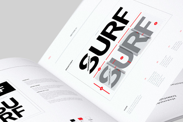
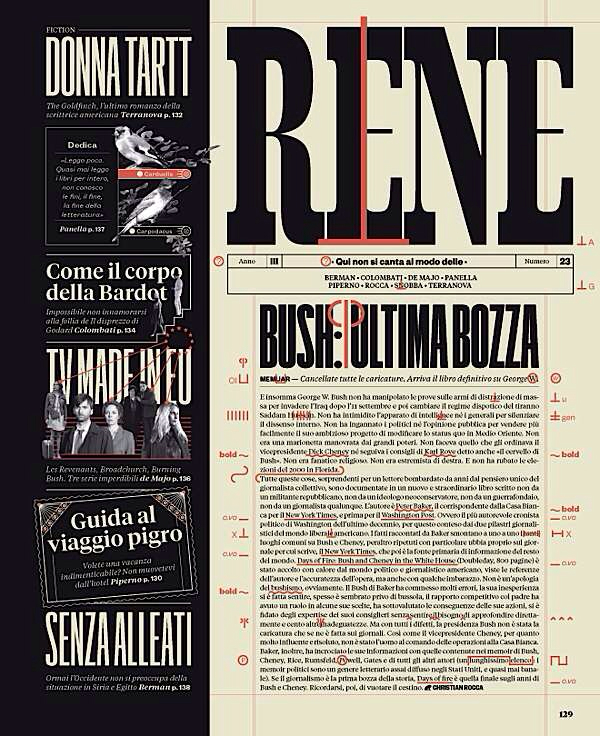
The page is also quite beautiful. Print designers have been assembling stunning products for decades that demonstrate eminently fluid layouts and a creative use of space that has yet to be matched in digital design (that’s my opinion of course). For example, here’s are a few pages from the recent redesign of Transworld Surf and the Italian magazine IL:
With the rise of the computer, pages were adopted into the digital world, even if in a slightly altered format. The page construct is of course present in applications like Word and PostScript to build products that will end up on physical paper, but the page also provided a convenient metaphor for the amount of content that could be displayed on a monitor at any given time. Page up and down keys appeared to allow users to jump up and down by an entire screen of content. To this day, paging remains the standard navigational paradigm in programs like Vim to allow users efficient access to view and edit their data.
If you’re not familiar with navigating content by page, try pressing your Space bar as soon as you’ve finished reading what’s on your screen. Notice how the content you see gets refreshed with no overlap and no repetition.
Scan & scroll, hypertext, and tablets
As the mouse became more widespread and the computer became more established as its own medium and started to relinquish its analogs with the real world, the page lost its dominance and was replaced by today’s more common practice of scanning content while simultaneously scrolling a document incrementally. While effective in its own right, this “scan and scroll” technique is more difficult to read when compared to a page as the text becomes a moving target shifting up or down the screen as the eye tries to keep pace.
As the web browser emerged, the page’s convenient constraint on width that helped bound line length was also temporarily lost as browsers defaulted to expanding text occupy as much screen real estate as you were willing to give it (to see this in action, make mother fucking website full screen on a large monitor and try to read a paragraph). Modern designers account for this, but HTML’s poor defaults continue to produce documents with reduced legibility all over the web.
Despite being relegated to the realm of power users, paging remained quite effective for anyone inclined to use it, but the more meteoric rise of JavaScript is finally starting to take its toll on this old usability feature. Anchored headers as depicted in the screenshots below are a common sight these days. They seem innocent enough until you realize that when paging in either direction, the header will hide its own height worth of content, rendering the paging function unusable.


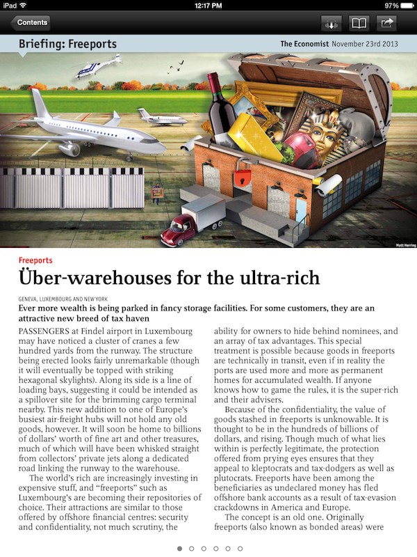
The more recent development of tablets has also sent pages spiraling toward obsolescence as they’re not a native concept in platforms like Android and iOS. In the world of touch-screen portables, not even apps renowned for their well-designed content consuming experiences provide paging mechanisms, leaving users with no option but to “scan and scroll”.
Tablets as magazines
There’s a class of tablet applications that design their experience around having the user interact with the tablet more like it was a magazine than a PC, and the biggest difference in design is whether the user interacts with the app as if it was a set of pages or a large continuous block. Apps like Flipboard and iOS’s Newsstand lead the charge in this area, both of which provide pleasant and efficient interfaces that are outright fun to use.

Slowing the fall
Barring an explosion in popularity of digital magazines through apps like Newsstand, there’s a good chance that the page in its traditional form is dead (in the digital world at least). Some of its inherited usability features like constrained width may carry on forever, but its precisely fixed proportions may be gone for good.
But there is hope. You can help preserve what the functionality that we already have today by avoiding common pitfalls when building rich Javascript-based web applications:
- Don’t anchor elements that obscure vertical space (see the screenshots of fixed headers above for great examples of what not to do). Instead, float navigation to the left or right of your content where it won’t interfere. Or place navigation at the top and bottom of your content and trust that users will be able to find it if they want to.
- Don’t improperly capture key events that are commonly used for paging like Page Up, Page Down, and Space.
If you’re building a tablet application largely based around consuming content, help your users by providing some kind of paging mechanism. If enough developers started to do this, there’s a glimmer of hope that a standard paging mechanism/shortcut could start to emerge across entire platforms and allow the page to rise again.
Header image by Andreas Levers. Licensed under Creative Commons BY-NC 2.0.
Did I make a mistake? Please consider sending a pull request.

